Responsive Redesign
March 7, 2024In the handful of literature classes I've taken, I always download books from Project Gutenberg. It's an incredible website that offers tens of thousands of free ebooks; mainly classic literature. While I'd like to say that I download these books as soon as I read the syllabus, the reality is I often find myself going to gutenberg.org on my phone an hour before class starts, needing to read as much as possible before the bell. So I'm well acquainted with the challenges of the mobile website, making it a clear choice for my responsive redesign assignment.
The current responsive design at gutenberg.org/ebooks
Accessibility-wise, there's some good stuff (like alt text and form labels), but there are some missing labels as well as lots of contrast errors. Mobile is worse; in addition to the vague Menu button1 there is small text and smaller touch targets.
But the core usability issue for Project Gutenberg is that it's hard to actually find books:
- On mobile, the homepage of the website doesn't show any search bar, instead requiring a user to visit this separate page hidden in the "Menu".
- On the search page, there are 4 possible search styles: Quick, Advanced, Full Text, and Browsing (which isn't actually a search style, but is displayed like it is one). This creates confusion and choice paralysis.
- Some search fields in Advanced Search are unclear. For example, I didn't know that LoCC stands for "Library of Congress Classification". (The help popup explains fields like "Language", but not "LoCC").
Since searching books is the most common use case for the website, this redesign will center it on the homepage. Further, it will simplify the search experience, as well as the website navigation.
Visual Redesign
Next up was to visually redesign the website's layout, starting with simple sketching before gradually working towards a high-fidelity mockup. My sketches began with rapid ideating, before getting condensed into one final sketch.
Finally, I defined the responsive layout in wireframes. To fix the search and navigation problems outlined above, I made 4 key changes:
- Restructured the homescreen to immediately show the search UI (shown in green on the annotated wireframe)
- Moved advanced searching into optional filter chips, (à la Google Flights), each opening a dropdown that includes an explanation of the field (shown in blue)
- Move search results inline, showing category suggestions when there's no search term (shown in yellow)
- Simplified the navigation into three core options: Search, About,2 and Donate (shown in red)
Before creating the final hi-fi mockup, I created a style guide. This was essential to creating the mockup: not only did it ensure component consistency and define the vibes of the website, it helped me ensure the site met accessiblity standards.
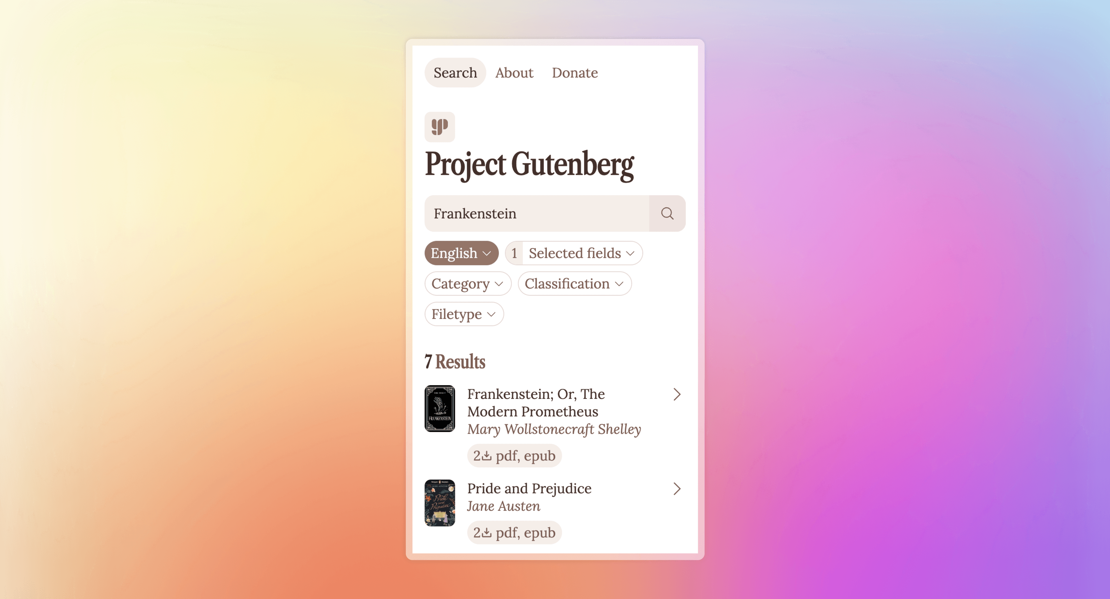
Finally, it was time to create the hi-fi mockup, based on the wireframes and the style guide.
HTML/CSS Implementation
Mockup in hand, all that was left was the small, small task of actually coding the entire thing. I was worried about pulling this off, but the mockup process made it much easier—I knew all of the styles, spacing, and sizes that were needed, so all I had to do was replicate what I'd already done. The biggest challenge was switching between the Categories and Results sections based on the contents of the search bar, which required some serious CSS wizardry to pull off.3 Finally, I deployed the final site on GitHub Pages for the world (or at least the TAs) to see!
The mobile Menu button is very generic and doesn't indicate what its options are. (Even the desktop expansion into About, Search and Browse, Help, and Donate has questionably categorized links.) In addition to being a bad user experience, it makes users less likely to find the Donate button, which is important for maintaining the website financially.
A further extension of this assignment would then redesign the About page to encompass the myriad of links contained in the current menu.
For those interested, the wizardry works like this. CSS inputs have a pseudo-class :placeholder-shown that only applies to an input if it's empty (and thus its placeholder is showing). Combined with :has() on the parent section and some clever use of the sibling selector, the Categories and Results sections can be dynamically shown or hidden. Code here.